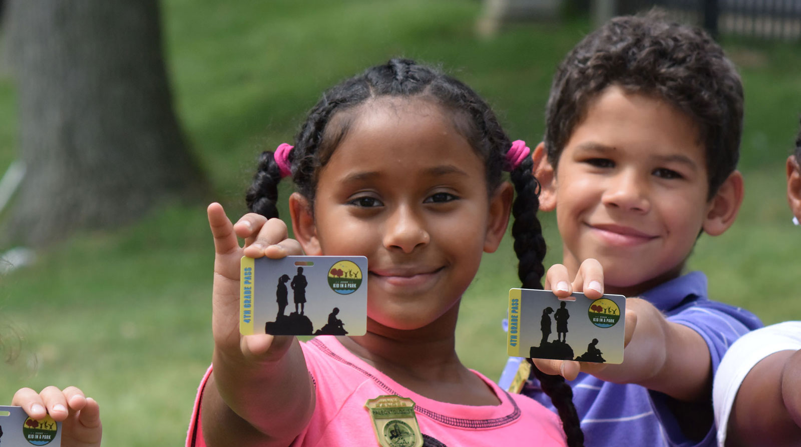
 Students from Samuel W. Tucker Elementary School receive an Every Kid
in a Park pass. Photo credit: Department of Interior.
At first glance, the phrases “government website” and “for kids,” might not seem to go hand in hand.
But the launch of Every Kid in a Park highlights how user research can bring beautiful, useful design to federal websites — including those aimed at children.
Every Kid in a Park gives U.S. fourth graders free access to all federal lands and water — including national parks, forests, wildlife refuges, and marine sanctuaries — for a full year. And they can bring their families and friends with them for free, too.
“I can’t wait for my future fourth grader to take advantage of the Every Kid in a Park program,” said Denise Turner Roth, the head of the General Services Administration (GSA). “As both a parent and the Administrator of GSA, I’m thrilled that we were able to use some of the innovative skills we have at 18F to develop this kid-friendly website for the Department of Interior.”
everykidinapark.gov is the landing page for that program. It includes a comprehensive list of where kids can go, explains how the program works, and shows how to print a pass. Best of all, it was designed, developed, and written for 10-year-olds.
Here at 18F, we were proud to develop the site in partnership with the U.S. Department of Interior and other federal land management agencies.
“I’m so proud to be part of this initiative that gets children out from in front of their screens indoors to great, wild, and exciting outdoors,” 18F Developer Shashank Khandelwal said. Khandelwal served as the website’s product manager.
This sentiment was echoed across team members. Christine Cheung, the site’s lead developer said it was a joy to work on such a passionate team.
“As a fan and ardent visitor of national parks myself, I’ve been so happy to be involved in a project that is focused on getting the next generation out there exploring,” Cheung said.
From the outset, our team knew the Interior Department made for an exciting, forward-thinking partner. Before we got involved, they hosted a design studio, a mini-hackathon, and three rounds of user testing with the University of Maryland’s Kids Team.
They had already honed in on one product — a paper pass — that worked for both kids and the national sites they’d be visiting. In short, our partners were well on the way to an excellent product when we had the opportunity to join.
A small group of 18F team members — including one Presidential Innovation Fellow — were thrilled to jump in, and together we began our work with user-centered design and plain language. We made pages, tested them with users, and adjusted our views accordingly.
That testing “reminded us of the creativity that can come from young minds,” Presidential Innovation Fellow Chris Goranson said.
The resulting website was carefully crafted, from the colors and the photos, to the text on every page. Even the information for parents and teachers was designed to be understandable for our primary users — fourth graders.
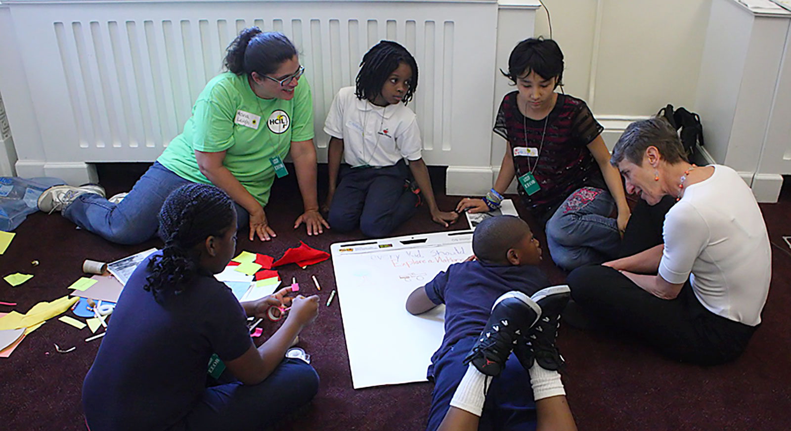
 Sally Jewell, Secretary of the U.S. Department of the Interior, sits with kids as they help co-design the Every Kid in a Park website using methods developed by the University of Maryland Human Computer Interaction KidsTeam Lab. Photo Credit: Evan Golub, 2015.
Building a site for kids has unique challenges
“I love to design websites for kids, especially when those sites coax them right back offline again and encourage them to explore,” said Eric Ronne, the site’s lead visual designer. “That helped make this project especially meaningful for me.”
The website’s visual design relies on bright colors, friendly icons, and plentiful pictures. In its first iteration, we featured bucolic landscapes and a nightscape. But kids found the dark photo scary, and they wanted to see more pictures of people playing and swimming. We found more daytime photos and photos with kids in hammocks and families exploring.
What to do when your audience doesn’t know the word “federal”
We also trimmed content as much as possible. Our first draft was sparse by government standards, but students still disliked the paragraphs they encountered. So we scaled back the text.
Word choice was a challenge, too. We originally called “passes” “vouchers,” but most of our users didn’t have that word in their vocabulary. They also didn’t know what “federal” meant. So we eliminated it wherever we could — no easy feat on a federal website.
Our goal was to write the whole site — including the parents and educators pages — at a fourth-grade level. That goal was backed by data that showed fourth graders immediately wanted to click on the “grown-ups” pages, to see what they contained.
By launch, we’d combed through every sentence, eliminating as many complex words and phrases as possible. We even re-wrote the legal, privacy policy to read within a fourth-grade level. One of our last obstacles was the social media tags.
We wanted to feature #EveryKidInAPark prominently — so people knew how to share their stories. We built out a standard footer that included the official hashtag and icons for Twitter (@everykidinapark), Instagram, and Facebook.
But when we tested it with fourth graders? They’re too young to be on Facebook, which bans users under 13. Many of the kids said they had house rules against Instagram accounts. None of them used Twitter.
A site designed for 10-year-olds shouldn’t recommend social media they can’t visit or don’t use. So those icons — ubiquitous in so much web design — had to go.
The result
A huge amount of credit goes to our partners at the Interior Department. We couldn’t have envisioned and enacted this site without their support.
What launched on September 1 is the first version of the site. We’re constantly working to make updates and improvements. Check it out for yourself! We’d love your feedback. Drop us a line or issue a pull request if you have suggestions or questions!

