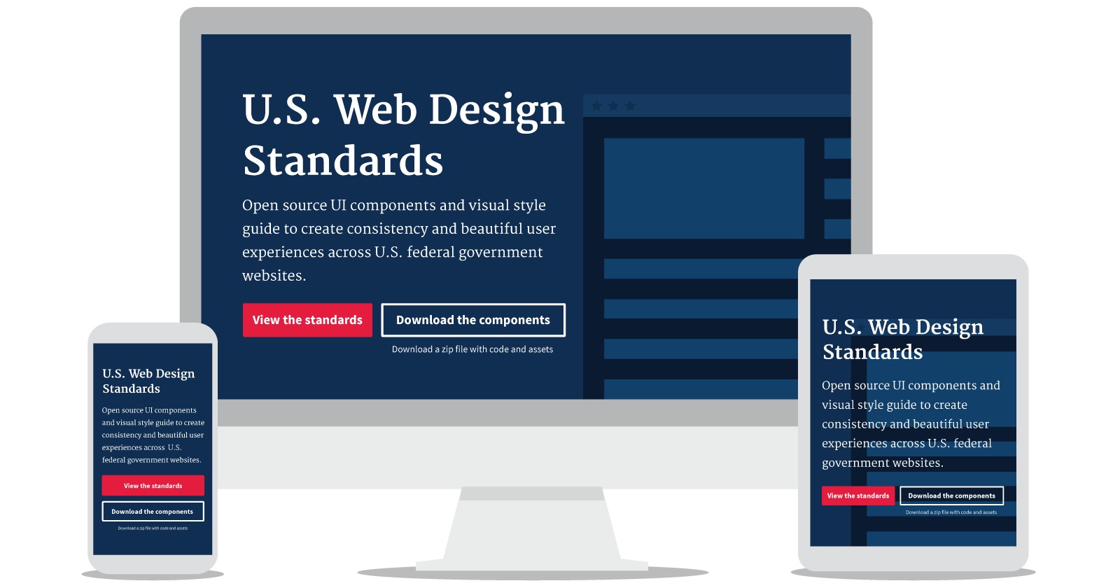
Since our launch of the Draft U.S. Web Design Standards last September, hundreds of people have provided feedback on the project through GitHub issues and via email. We’ve received dozens of feature requests as well as over 400 contributions from the open source community.
Over the past five months, we’ve incorporated suggestions from the feedback we’ve received, resolved a number of outstanding issues, and made various updates to our content and structure. We’ve also thought about topics like accessibility, content strategy, and user-centered design — particularly as it relates to users of government websites.
Much of our work has come out of the user research conducted by our team and our colleagues on the Federal Front Door Team, who set out to better understand how the general public feels about and interacts with the federal government, so that we can design and build products that improve people’s experience across government agencies. Among their findings:
- People aren’t always able to differentiate between a government website and a website from the private sector. They use clues like domain names, official government logos, and trust-building language such as “this is an official government website” to evaluate the trustworthiness of a website.
- People sometimes have trouble with choice overload: when government websites give them too many choices or don’t explain the consequences of a certain choice.
- The general public wants to be able to “see” the process when interacting with federal agencies and programs. This includes knowing when their information has been received and reviewed, and overall clarity into why the process takes as long as it does.
Not all of these issues can be addressed with common UI elements from the Draft Standards, but they can be a start. Implementing consistent design patterns, such as colors and button styles, make it visually obvious that users are on a government website. And when interactions and forms start to look and feel the same, it lowers the mental energy required to complete them, especially when they are across multiple sites and agencies. In this way design patterns can simplify and clarify the consequences of making important choices.
For federal employees, standards and guidance on creating forms, communicating application status, and explaining processes can improve the quality of government services, while freeing up staff time to spend on more-expensive channels like call centers.
The Draft Standards in action
We’re excited to see government web administrators begin to use the Draft Standards on their sites. From vets.gov to usa.gov, we’ve seen over a dozen examples of websites using components from the Draft Standards on their sites.
In the coming days, we’ll be answering some frequently asked questions about the Draft Standards and detailing what we’ve learned and where we hope to go next.
As always, if you have additional questions or are thinking about similar topics, open an issue on GitHub or email us directly at uswebdesignstandards@gsa.gov. You can also contribute code and content to the project on GitHub.
This week, we released an update to the Draft Standards website and upgraded the Draft Standards themselves. This version introduces several backwards-incompatibility changes that will affect usage of the Draft Standards. You can read the release notes. Also, we now have a standardized way to keep up to date with our standards through the npm package for the Draft Standards.

