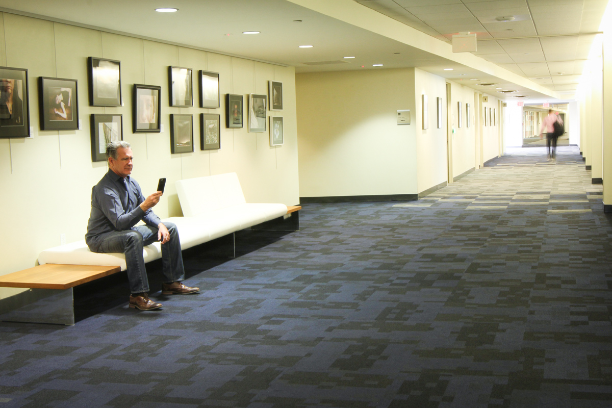
Not long ago, the General Service Administration’s regional headquarters on the Denver Federal Center campus looked like a stereotypical office space: cubicles sprawled down a long, fluorescent-lit hallway, and conference rooms and private offices lined the sides of the building with windows looking out on the foothills of the Rockies on one side, and downtown Denver on the other. The GSA’s two primary services, the Public Buildings Service (PBS) and the Federal Acquisition Service (FAS), were split with PBS in the main building, and FAS scattered around other buildings in the area. In 2014, the two services were slated to consolidate into one office space, a move that would save the agency money and open up valuable space for other federal agencies. There was only one problem: They didn’t have space to do so. “We were maxed out on cubicles,” said Andrew Myers, one of the leads on the re-design project.
Cubicles and private offices have a certain appeal to them: You can leave things there overnight, put up photos of your family, and keep your work organized on your desk. They also take up a lot of space, much more than most people actually need, and constrain people to working in the same space all the time. When Myers, his colleague Shelly Baxter, and the design team started thinking about how to make more space in the office, they started with the cube walls. “One of the designers took the existing furniture and came up with a pretty creative layout,” Baxter said.
Listen and iterate
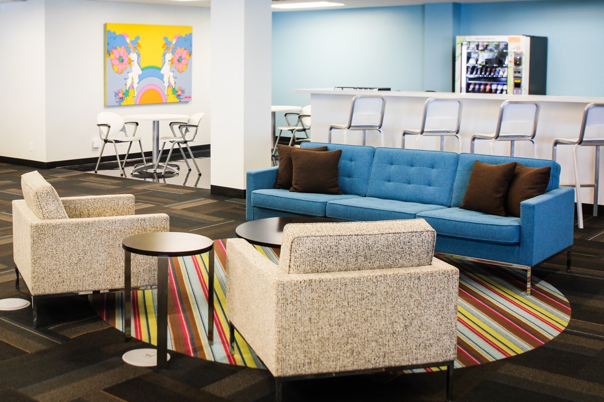
When tenants tour the GSA space today, they see standing desks, huddle rooms with glass walls, giant windows, and open spaces where people can work together. The only real semi-private office space you’ll see is for the Regional Administrator, Sue Damour, and her door is almost always open. Getting there was a process of testing hypotheses and adjusting to human and policy needs.
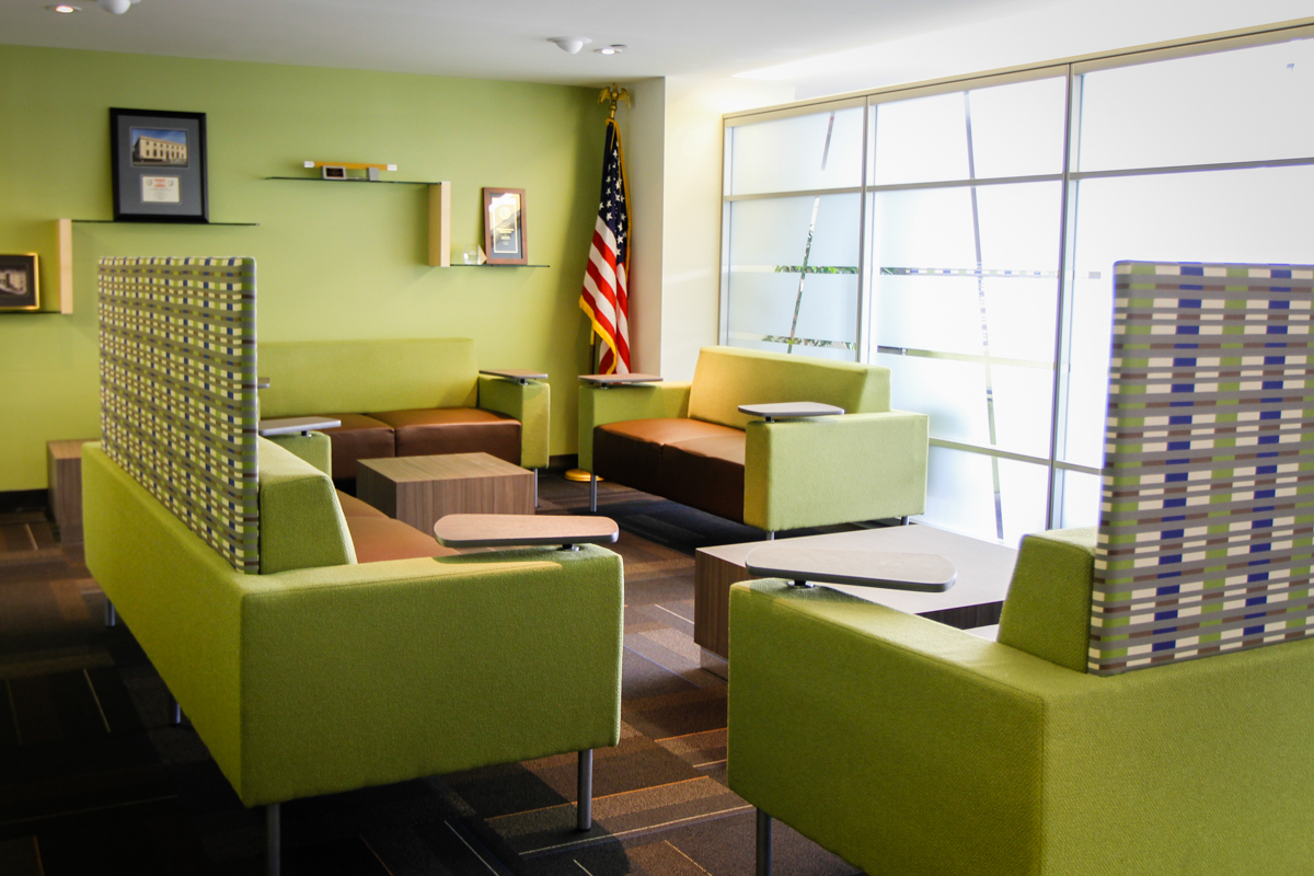
Part of GSA’s mission is to find innovative ways to design workplaces that make the federal government more efficient and productive. The Rocky Mountain Region houses 28 tenants on the Denver Federal Center campus. Myers and Baxter said they set up several workplaces in the building as working showrooms. Each room had different furniture and layouts and the staff would offer tours for their tenants to gauge their reactions and show them what was possible for their own offices.
PBS was, in a way, exercising play 1 from the Digital Services Playbook. Just like we test features here at 18F before releasing them too widely, they were testing their work with real people before disrupting their customers at other agencies.
From these showrooms, they learned their tenants all had more employees to squeeze into smaller spaces than they had designed for. They also learned what worked and what people wanted more of. They learned they’d need to create a distraction-free space so people could get away from the noisy, high traffic parts of the building and get work done, and spaces to take phone calls or meet with each other without disturbing others. To meet these needs, they created a quiet zone and another area with a wide mix of phone booths and conference rooms, so whether you’re on the phone by yourself, or in a group of 20, there’s a place for you to meet.
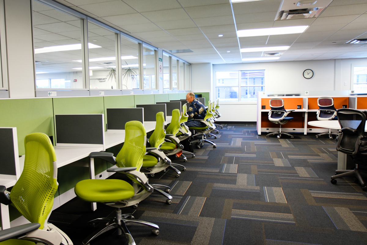
Over time, they’ve learned subtler things about the space: “Better access to wifi … added electrical outlets … we enhanced white noise,” said Baxter, and they’ve learned a lot about how human behavior didn’t match their assumptions. “We’ve noticed that certain people are magnets,” said Myers, “if you’re a manager and you sit somewhere, for whatever reason, your team ends up sitting near you.” Whether that’s because of unspoken pressure from managers to be near their employees, or personal preference, it was an unexpected outcome they hadn’t really designed for.
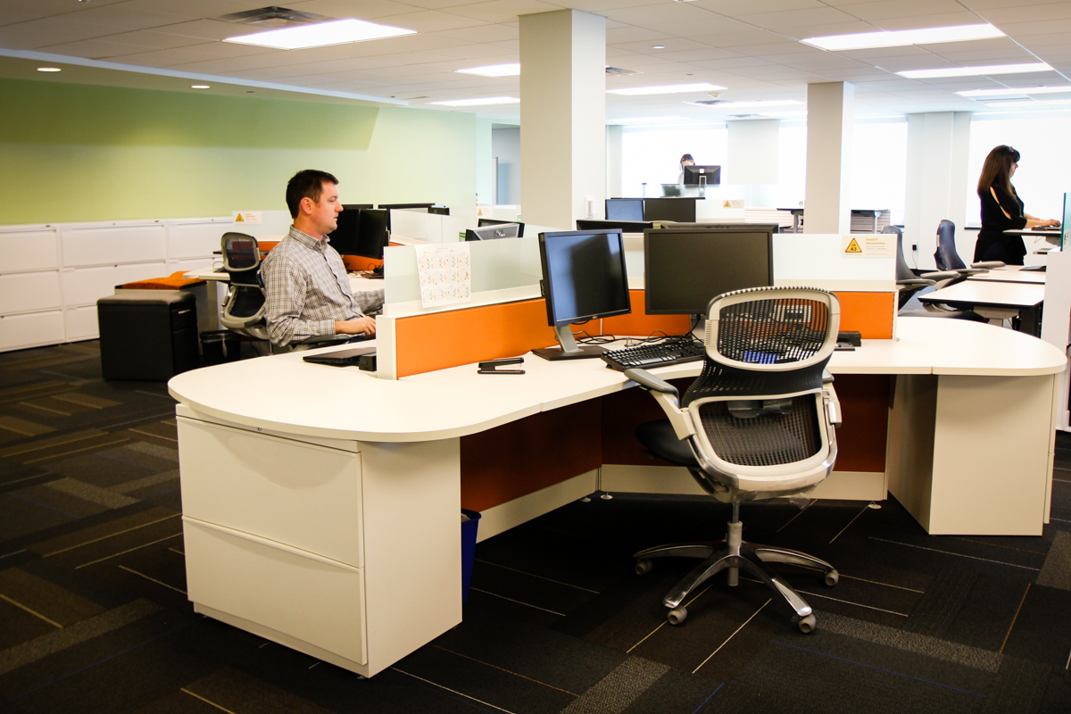
It’s been a little over a year since the redesign took place, but the work is not complete. They continue to refine their hypotheses about how people use the space and occasionally make changes to accommodate their reality. “People are creatures of habit,” Baxter said, “and we’ve started to see people assume that a desk designated ‘drop in’ belongs to a specific individual because that person sits there whenever they’re in the office.”
Redesigning the GSA’s workplace has been an iterative effort to discover how people want to work, how they can be most productive, and designing around those needs. It’s a great example of how human-centered design manifests itself in spaces outside of the tech world.
