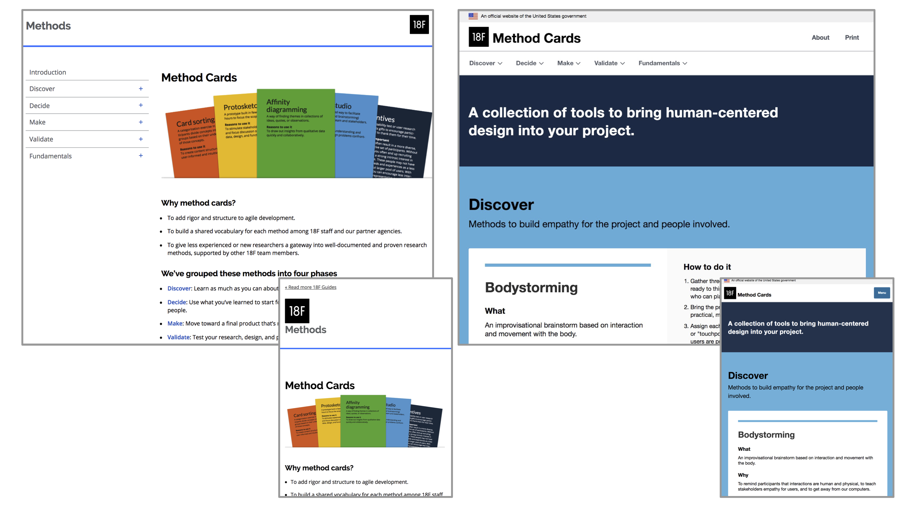
Recently, 18F released a new version of the Method Cards, a collection of tools that offer simple, “how-to” descriptions of research and design methods with a special emphasis on the use of those methods in government work. With this new release, the Method Cards have become easier to read and understand, as well as easier to print and circulate. We’ve also made it simpler for 18F to maintain the cards, which means you’ll get updates more frequently. The goal for all of this is to help people choose and apply human-centered design approaches when solving problems in government.
Meeting people where they are
The Method Cards came out of tools 18F uses on our own projects, so naturally we turned to them when we wanted to update the cards. We did some user interviews and affinity diagramming to investigate how users felt about the cards and how we could work to address those needs. One thing that we found was that while we build microsites all day long, a lot of the government runs on paper. It’s not where we want to be necessarily, but meeting people where they are is core to our philosophy.
We learned that users need to be able to easily print a single card so that they can have a physical copy of only the method they’re interested in. So we added CSS print styles and the ability to print one card or the entire deck directly from the site. (You can check out the print style sheets by exploring the individual card pages in GitHub.)
In government, people often need printed documents, but printed documents are so hard to maintain that they’re usually out of date. The cards’ new print styles not only make it easier for you to print the cards you want, they also support Markdown, which makes the cards easier for 18F to maintain and keep the printable versions up to date with the latest content.
We also learned that the content of the cards was not always written in a way that users could understand. So we did a thorough content audit to make the cards more accessible by removing jargon and explaining terms and concepts that assumed a background in human-centered design and agile methodologies.
Finally, we found that many users struggled to understand how to get started with the cards and how they could use them. People wanted to see examples of how others have used these tools in practice, so we added links to how 18F applies the tools in our own work.
Improving the public’s experience
As a part of GSA’s Technology Transformation Services (TTS), 18F shares TTS’ mission to “improve the public’s experience with the government by helping agencies build, buy and share technology that allows them to better serve the public.” The Method Cards help TTS to achieve this goal by publicly and freely offering an easy-to-use collection of tools that have proven effective both inside and outside of government in guiding the design of services that prioritize people’s needs.
There are thousands of government projects that could benefit from design and from the tools presented by the Method Cards. With this new release of the cards, we wanted to scale up our efforts to reach people in government who may be new to human-centered design, and who may be just starting to make a case for research and design at their agencies. As Jared Spool, user interface design expert and founder of the User Interface Engineering research firm, once said of the Method Cards:
“[They] are empowerment tools. They give people confidence they’re doing the right thing. That’s where the real long-term benefit is. There’s not ever going to be enough of you [designers in government]…those tools are absolutely critical.”
Empowering agencies to transform the way they’ve historically designed technology is of central importance to 18F, and the Method Cards are one of the key ways that we try to instill confidence in people who take on that challenge.

Back to testing
We used human-centered design techniques to guide these changes to the cards, and now we’re back at it to test how well they work — with real users. If you’d like to reach out about your experience using the cards, you can reach us at 18F@gsa.gov or give us feedback on the new site in a GitHub issue. We will let you know what our research turns up!

