This post was originally published on the DigitalGov blog. Maya Benari is an 18F front-end designer working on USWDS and Dan Williams is the USWDS product lead
Today, we’re launching U.S. Web Design System 2.0 (USWDS 2.0), a new foundation for the future of our design system. This new version was designed to make it easier for any project to integrate USWDS and use it to support both your mission and the needs of your audience.
USWDS is a library of code, tools, and guidance to help government teams design and build fast, accessible, mobile-friendly government websites backed by user research and modern best practices. USWDS 2.0 is an important update to the design system — it introduces a powerful toolkit of new features to help make creating useful, consistent digital services faster, simpler, and more fun.
We’re proud that USWDS currently powers nearly 200 federal websites and we’re committed to making the design system work better for any federal website. With USWDS 2.0 we’re introducing a design system that’s built to grow with your needs — to help teams build better, more engaging websites for the American public.
Over the last two years, we’ve listened to the designers and developers using USWDS to build their websites. We’ve conducted interviews with project teams, listened to public feedback, and paid close attention to the issues in our GitHub repos. We’ve conducted our own research on how designers and developers communicate with each other, and the tools they use to prototype. This research and feedback shaped our priorities for USWDS 2.0:
- Encourage modular, iterative, user-centered design
- Promote accessibility and mobile friendliness
- Develop a consistent design language
- Support designing with flexibility and coherence
- Lead with dependable guidance
- Allow teams to prototype and build quickly
- Establish a reliable foundation for growth
So, what’s new in USWDS 2.0?
Easier Incremental Adoption
Add a component, not a headache
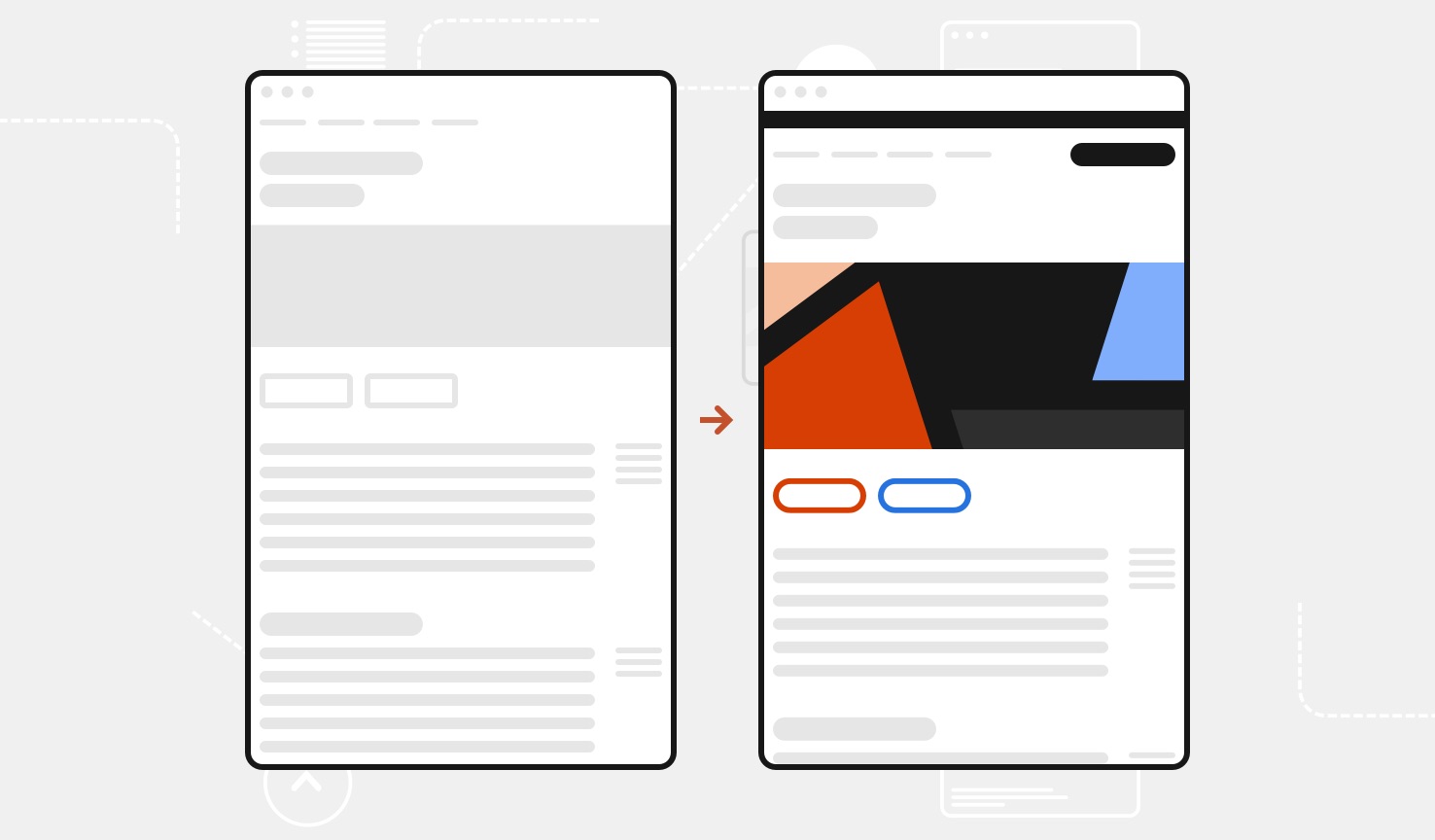
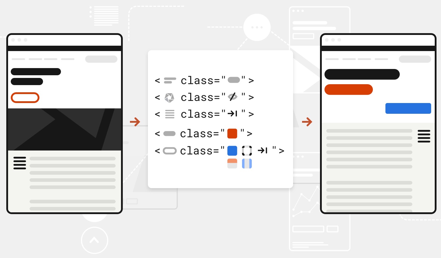
You don’t need to totally redesign your existing site to get started with USWDS. Adding USWDS 2.0 doesn’t mean breaking existing site functionality, so it’s easier to make incremental changes. Our components and code play well with existing styles, and it’s easy to adapt our default styles to the look-and-feel your users trust.
- Won’t affect your existing styles… until you want it to
- Isolated class-based styling
- Customizable base font size
- Supports custom typefaces
- Provides resilient, modular components
Practical Design Tokens
A common language for designers and developers
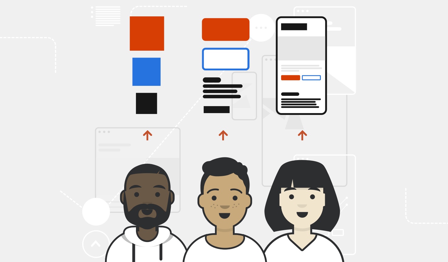
Design and development are all about decision making. Making decisions and communicating their details with the team takes time and has a cost, both in money and energy. USWDS 2.0 design tokens are the common building blocks of visual design decisions (like color, typescale, and spacing units) that all USWDS projects share. Using a design token means that designers and developers spend less time fussing over pixels, eyedroppering hex codes, and redlining, and more time solving problems.
- Design tokens are a common language between designers and developers
- Creates simple standardized palettes
- Makes for a streamlined handoff
- Allows a faster response to feedback
- Integrates with best-practice guidance
- Provides coherent and expressive palettes
- Even spacing units (based on 8px) yield reliable spacing and centering
- Typescale outputs consistently and predictably, regardless of typeface
Accessible Color System
From AA Large to AAA: Section 508 contrast made simple
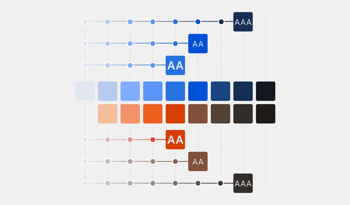
Making a good color decision means making an accessible color decision. The USWDS 2.0 color system makes it simple and predictable to pick accessible color pairs. Each USWDS system color has a numeric grade (like the 50 in red-50).
The difference between any two colors’ grades is what we call the magic number. Magic numbers of 40+ achieve AA Large contrast, magic numbers of 50+ achieve AA contrast, and magic numbers of 70+ achieve AAA contrast.
- Magic number makes contrast decisions a snap
- Encourages accessible color choices for your mission and brand
- Supports practical project theme palettes
- Is the foundation for expressive color families
Expressive Theming
Powered by your mission and user needs
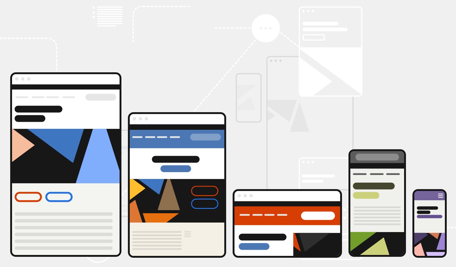
Every project is different. Different audiences, different missions, and different goals require different solutions. USWDS 2.0 helps teams reinvent the experience without reinventing the wheel with a flexible design system that encourages customization consistent with our best-practice guidance. Because using user-centered design to extend our defaults and build new things shouldn’t have to mean abandoning USWDS guidance altogether.
- Normalized typefaces allow custom typeface support
- It’s easier to match your brand to USWDS
- Custom settings power themeable layouts
- Integrated with tokens and utilities
Powerful Utility Classes
Prototype faster to get your designs in front of real users
Building and testing a prototype is an invaluable step to understanding how real people use our services. Utility classes are a modern way to use USWDS design tokens to rapidly test a new idea, make tweaks to existing components, or design in code. USWDS utilities help teams deliver actionable prototypes quickly and consistently, and make quick modifications to production components without writing high-specificity CSS.
- Build new components or modify old ones without touching production CSS
- Uses modular, atomic, and mobile-first design
- Optimized for legibility and comprehension
- Sophisticated customization options
- Easy to transfer into production Sass with integrated functions and mixins
- 25 KB gzipped, but optional
Simplified 12-Column Layout Grid
A simple, powerful, flexible grid
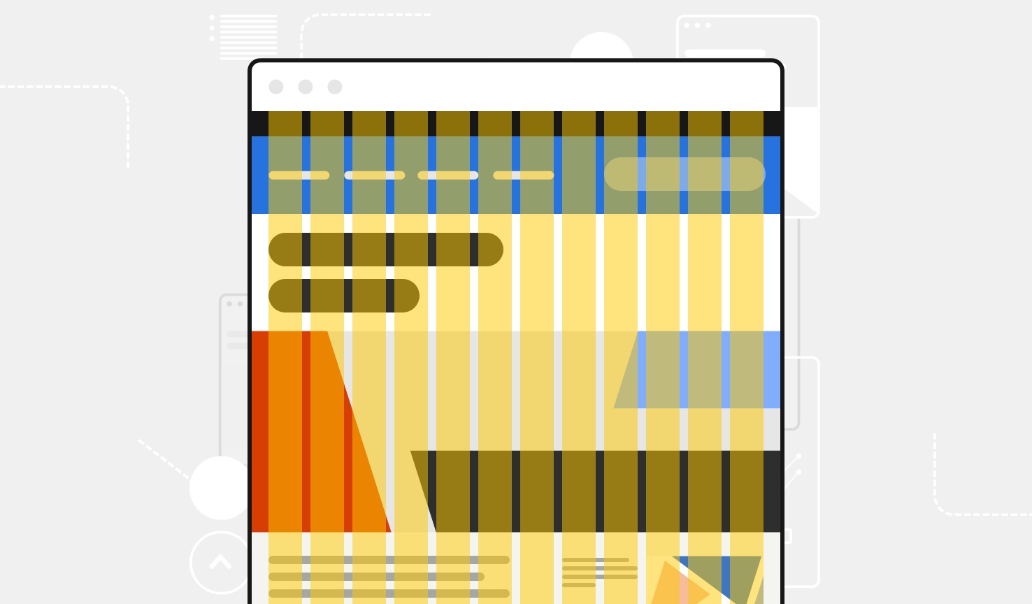
Layout grids give any website visual coherence. The USWDS 2.0 layout grid is a familiar flexbox-powered grid that gives predictable control to designers and developers. The grid’s simple, nestable structure means any component and any layout, large or small, can implement a grid in a snap — and its mobile-first layout options make them customizable to any screen or situation.
- Similar to Bootstrap 4 and Foundation
- Uses a familiar row and column–based structure
- Built with Flexbox
- Predictable and nestable
- Designed to be mobile-first and responsive
Introducing Public Sans
A free, open source typeface from USWDS
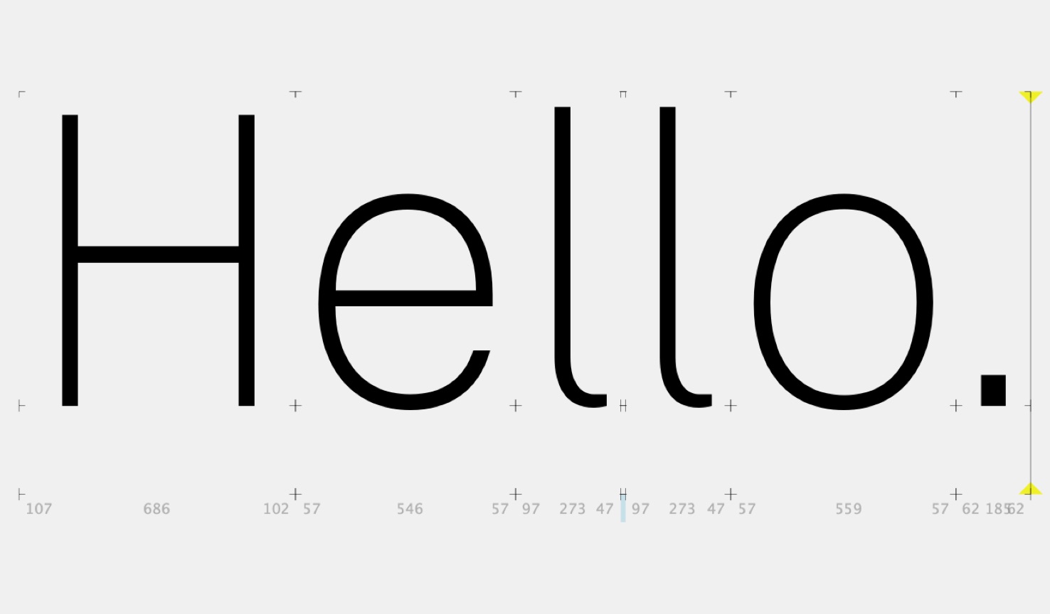
USWDS 2.0 adds built-in support for custom typefaces, but sometimes you need something free, simple, and readable that just isn’t Helvetica. Public Sans is an open source, open license (SIL Open Font License 1.1) typeface designed and maintained by USWDS, adapted from Libre Franklin. We intend Public Sans to be a model of how to design an open source typeface in public, with contributions and feedback from the public — to deliver a useful, neutral, sans serif now and continuously improve it into the future.
- A clear, strong, neutral face for interfaces and continuous text
- Developed by USWDS
- A consistent alternative to system fonts or other neutral sans serifs
- Principles driven: designed for continuous outcome-based improvement
- Free and open-source
- Features tabular numerals for data design
Built to Grow
A stable foundation for the future
USWDS 2.0 is built to grow. It exists to help teams build new things and explore new solutions — to be more useful to any federal website and to adapt to new problems and new insights. Our new release is the foundation for the future of the design system and a way to maintain predictable, reliable coherence in an ever-changing world of new technology and evolving expectations. We can’t wait to see what you build with it.
- No new components, but all new components
- Consistent, predictable BEM naming
- Overhauled documentation
- Streamlined development process
- Easier to integrate new components from outside projects
- Prepared to grow and adapt to user needs and industry best practices
Like any true 2.0, this is a living product. We’ll continue to test our decisions and assumptions with real-world feedback as it develops and evolves. We encourage you to explore USWDS 2.0, contribute your own code and ideas, and leave feedback on GitHub, email, or our Slack channel. And join our new mailing list by sending an email to uswds-subscribe-request@listserv.gsa.gov. We’ll use your input to continuously improve the system with ongoing regular releases. We’re listening.
USWDS is a team effort, built in the open for the public good. A heartfelt thank you to everyone who contributes to the project and whose work supports and inspires our own — your passion, smarts, and support are invaluable. We can’t do it without you.
A sincere thanks to Sara Cope, Stephanie Green, Jeremy Zilar, Jacob Parcell, Toni Bonitto, Andre Francisco, Dahianna Salazar Foreman, Wesley Thompson, Adam Biagianti, John Donmoyer, Brian Hurst, Steve Walker, Jen Thibault, Aviva Oskow, Christine Bath, Austin Hernandez, Nick Ng, Eddie Tejeda, Amir Reavis-Bey, Miguel Sousa, Scott Kellum, Eli Altman, Aaron Borden, Andrew Dunkman, Sawyer Hollenshead, Sha Hwang, Jared Cunha, Matt Langan, Heather Battaglia, T. Carter Baxter, Matt Yoder, David Way, nolawi, Amber Reed, Shawn Allen, Micah Taylor, Scott Weber, Brendan Sudol, Brandon Ruffridge, Atul Varma, Maria Marrero, bet4a, Robert Romore, Dave Methvin, Nick Schonning, cathrowe, fat32, Juliette Cezzar, Pablo Stanley, Eric Ronne, Ryan Thurlwell, Linzi Berry, Sam Soffes, Pablo Impallari, and Dave Crossland.

