This is part 5 and the last post in a series on the importance of human-centered design when evaluating IT centralization. As part of a 10x project, we’ve synthesized 18F’s learnings from agency partners who’ve been through centralization efforts before and have wisdom to share. The series explores how and why taking the time to prioritize users will mitigate risks and yield services that work better for the people they serve.
In this case study, we’ll explore an example of a centralization success. To write this case study, we revisited the process the USWDS team used to create version 1.0 and interviewed them about what has happened since the original launch.
Federal websites are the front door to government services. They’re often the first thing you encounter when interacting with the government. With nearly 30,000 U.S federal websites and almost no consistency between them, it was crucial to create a centralized system. This would allow agencies to build consistent, effective, easy-to-use digital experiences quickly and at a reduced cost.

- The challenge: To create visual consistency across the nearly 30,000 U.S. federal websites in order to save the government considerable time and budget on design and development resources
- The outcome: U.S. Web Design System - a centralized tool that’s free and accessible for all federal agencies
- The impact: Agencies save on resources (estimated savings: $100,000 per project that uses USWDS) and the American public has a much better experience interacting with consistent, easy-to-use government services
Since USWDS launched in 2015, over 180 government projects have adopted USWDS. Pretty awesome, right? From the Department of Veterans’ Affairs to the U.S. Department of Agriculture, government teams are coming together to set a new bar for federal websites and prioritize user experiences thanks to this robust shared tool. We can estimate that agencies are saving around $100,000 per project on design and developer resources when using USWDS.
Now consider a pre-USWDS world: let’s say a young veteran named Joanne is applying for federal student loans. Joanne has to wade through multiple agency websites to access federal programs to help her afford college. But Joanne is overwhelmed by how hard these tools are to use, ultimately missing opportunities and feeling frustrated. The system that’s supposed to help her instead stood in her way. Creating consistency across federal systems helps people like Joanne access services they need and increases their trust in the government.
A team of designers and developers from 18F and USDS, along with other agencies (Department of Education, U.S. Citizens and Immigration Services, Consumer Financial Protection Bureau, U.S. Department of Agriculture, and USA.gov) went to work unifying a complex web of different interfaces, navigation tools, colors, fonts, and other visual identities with the goal of creating one centralized shared tool.
Here are some important lessons the USWDS team learned along the way:
1. Empower your team
You’ll need a dedicated group to work on your centralization effort as well as support from leadership to give you the air cover required to do this work. It should be as important as any other project.
Start by forming a multidisciplinary team. For many IT centralization efforts, this will mean bringing together expertise from IT, security, operations, and your developers. You’ll also want someone to fulfill the role of project manager and product owner to guide the project and prioritize the right goals. When you give people a stake in the system, they’ll feel invested to use the service and contribute back, increasing your chances of success in the end.
2. Reinvent the experience, not the wheel
Find time for your team to gather together and answer two basic questions: 1) where are the problems? and 2) are these problems solvable? Find out if there are common needs and themes across different teams. Talk to people who will actually be using the centralized service or system and find out: what aspects of the service are required to do your job?
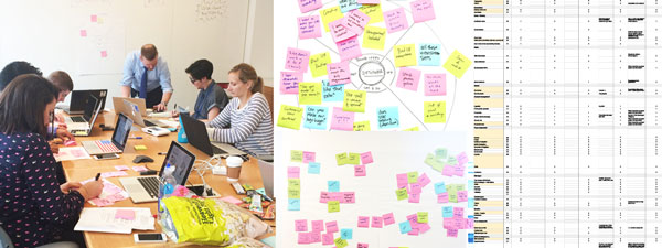
For the USWDS team, this meant coming together to build early consensus on 1) what already existed in the design inventory and 2) what the team wanted from a new system. Team members wrote down all the parts that already made up federal websites and brainstormed ideas for new features, clustering ideas on a wall and grouping them together to find common patterns.
You may find that some of the simplest themes and patterns will come up again and again. Make sure you give people the opportunity to come together and build consensus early on.
3. Look for duplication of efforts
Where is your team repeating efforts across different tools and services? Where are you wasting time? What takes the longest time or is the most challenging? Where does friction arise?

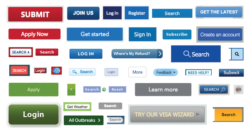
For the USWDS team, this meant asking: Do we really need 32 different shades of blue? And do we need 64 types of buttons? Probably not. Surfacing and categorizing duplication of efforts across different components allowed the team to see the inconsistencies among government websites as well as what they all had in common.
4. Prioritize certain areas of focus
There are many methods to help a group prioritize areas of focus. One of the simplest methods is dot-voting. Allow the group to vote on different issues or themes that are most important to address first to help you rank priorities.
For the USWDS team, dot-voting helped the team figure out 1) which areas to start working on first and 2) which design styles they favored most when developing a new system. They even put their ideas on GitHub to solicit feedback from a wider range of government employees who weren’t in the room in order to incorporate outside feedback.
5. Start small and iterate fast
Figure out what your core needs are, prototype them, and get to testing! Bite off small chunks and start iterating right away. That’s how you’ll find out what’s missing and what needs reshaping before you start investing too much time and resources — it’ll be a much heavier lift to rebuild later. Start with a limited set of components that will give you real answers right away. Guidance will come once you start putting these out in the world and into people’s hands.
6. Don’t work in a vacuum
Once your products are ready to test, find the right people to test them. Who will actually be using the service? Let them guide your decisions as you evolve the project. It’s better to get your work out early even if certain areas are still unfinished or rough around the edges. As you build products and test them with real users, you’ll have more guidance on where to go next, allowing you to make improvements more efficiently and effectively.
7. Reuse when it makes sense to, but not all the time
It’s great to see how other agencies have solved problems and reuse when you can, but know that their solutions are solving their problems. Each agency should be mindful of its unique mission and unique needs across teams. Individual problems may need an individual approach, and that’s fine. Don’t fall into the trap of “this is what a design library should look like” or “this is what an HR recruiting system should look like” just because another agency is doing it a certain way.
8. Be your own cheerleader
Get teams excited about the centralization effort! Talk about the value they’ll get when using the new service of system. In the case of USWDS, the added value was: consistent, beautiful, user-friendly design with accessible interfaces that will save agencies time and money. Now that’s pretty excitement-worthy, right? Be your own cheerleader and users will be more likely to invest in your service.
9. Be centralization-flexible
Nobody likes when new rules and processes are forced upon them. Instead give people opportunities to access centralized services when it makes sense to, but also leave some room for customization.
In the case of USWDS, there was some tension between the standardization and customization of design standards. USWDS was never intended to be prescriptive — instead it’s a robust resource providing a foundational design language.
Ultimately the goal of centralization is to create a tool that helps users get to where they need to go more quickly, and in some cases, users will need to customize to get there. Leave space for this.
10. Offer multiple feedback outlets and stay chatty
Give people a variety of places they can reach out to you, whether on GitHub, Slack channels, email accounts, a help desk, or other communication lines.
One way USWDS stays in touch with users? They have a standing monthly call that serves as an open forum for agency partners to join and hear more about what’s going on. (How great is that?) This is a chance for the USWDS team to share updates and allow any community members to speak up with feedback.
USWDS also shares their roadmap publicly so everyone knows what issues they’re paying attention to and which ones they’re not paying attention to (and why).
Conclusion
The most important bit of advice we can offer? When embarking on a big centralization effort — and the USWDS was one big beast of a project — invite your users to participate throughout the process and make it their own. Only when people have a stake in the system will they feel invested to use it and contribute back, making it more dynamic, versatile, and able to stand the test of time.
Read more about how USWDS was built on the 18F blog here. Special thanks to Maya Benari and Dan O. Williams for contributing their wisdom to this post!

