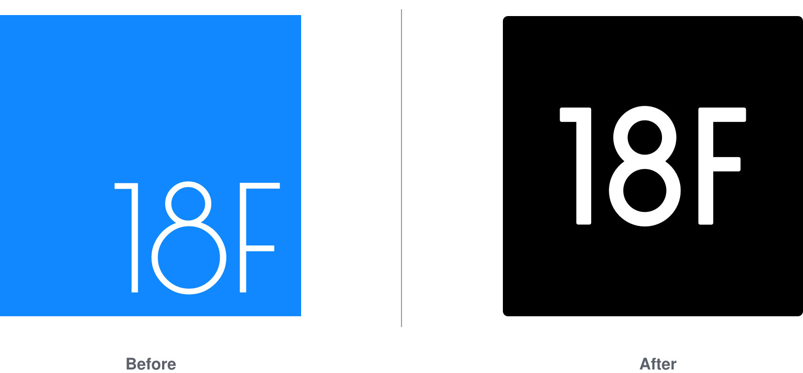
18F is known for many things: Our commitment to working in the open, our use of agile methodologies, and our dedication to helping folks build more useful, beautiful government services. We’ve also been known to build the plane as we fly it, so to speak — to iterate on something immediately upon completing one version of it.
Such was the case with our original visual identity. When we as an organization were just getting started, our team created enough assets to get things up and running. Until recently, 18F’s visual identity included only a logo, a few primary colors (#1188FF, white, and some highlights for alerts), a display font (Raleway), and some loose patterns of basic design elements, though these were malleable (we had no central style guide).
Though we did have a visual style, we’d always had a plan to keep refining it as our organization grew. Recently, members of our visual design team have been crafting and refining our new visual identity, and we’re thrilled to introduce it.
In our early days, we let our work do the talking for us rather than dedicating resources to the development of a comprehensive visual identity. Our Outreach team has done (and continues to do) an amazing job of sharing our stories with the world, and dozens of 18F team members have presented on their individual projects, helping spread 18F’s message.
During the summer of 2015, we finally had some hours to dedicate to refining our visual identity. Last August, a small group of designers gathered to start the rebranding process, and our new look as you see it today took shape at that two-day summer work session. (We’ll be publishing a separate post about this session in the near future, so stay tuned.)
As is the case with all of 18F’s projects, the branding team began their work by considering user need. Our brandathon, as it came to be known, began with an organization-wide workshop on our core values; we used the results of this workshop to guide all our subsequent work. After this workshop, several design studios, and hours of work, the branding team had an initial set of deliverables to share with the rest of 18F. It included:
- A fully extended color palette (built for 508 compatibility)
- A single font family (a slightly customized version of Nimbus Sans L — a close, open-source cousin to Helvetica)
- An evolved logo that has higher color contrast and is more legible at smaller sizes (in other words, more accessible)
- Presentation templates for Keynote and Google Slides (PowerPoint is in the works)
- An internal website where folks can get the most up-to-date assets
- A dedicated Slack channel where people can get help using these new materials
Eric Ronne, who participated in the summer work session, summed up the team’s approach best: “At 18F we’re always changing and improving government interactions for our users. We iterate constantly here, and now we’ve iterated on our logo, too. Our goal was to refresh the mark while nodding to the past, to create a straightforward update that’s accessible, bold, modern, and flexible.”

Speaking to the technical considerations that impacted the logo refresh, Eric continued, “We retained the square shape in our refresh as a nod to the logo of our parent agency, GSA. We also created a style with a simple, unembellished ‘18F,’ free of any graphical icon. The text (drawn by our designer, Ryan) is the hero here. Centered in the square, it adds up to a clean, legible, and very flexible mark.”
In addition to updating the 18F logo, the branding team also created a collection of images featuring the new logo and inspirational messaging, the optimism of which is central to our brand. These images, which team members use as desktop art, weren’t exactly the highest priority “need” item, but they were a fast way to show the team how the new system could begin to flex in more exciting ways than just templates.
Though we’ve made great progress, our work is far from over. For now, we’re focusing on updating our logo on our site and our social sites around the web. Once we’ve accomplished that, we plan to create infographic templates for our social media accounts. And eventually, we’ll restructure and restyle our website, another outfit that we’ve outgrown since we started in March 2014.
Because our branding team is small and our priority is always our work with our agency partners, we expect that we’ll complete these remaining tasks incrementally during the next several months — stay tuned for updates. You can also expect future blog posts or public talks about agile branding from our team. Historically, the worlds of agile and developing brand identities have been hard to meld because it’s difficult to keep track of big-picture perceptions when you’re working in incremental features. We expect to learn a lot of about the process of agile branding as we go, and we’ll share our learnings with you all.


